Our music video took up the majority of our time to begin with, once we had completed this, or were nearing completion of this we decided to focus more of our time on the digipak and other ancillary products such as the website and magazine article.
As we are a new band we needed to make sure that we included suitable iconography and synergy between all of our products, this was so that the audience is able to see a conection between all of our products and relate them back to the band. everything has to work together and look good as a package, if it didn't it would look really un-professional. We also created different forms of marketing campaigns these were to be used on our social networking sights and website to boost the authenticity of the band.
Our main goal of our marketing campaigns was to put across an image, one that the audience could relate to, we wanted to make sure that throughout all of our products we looked like a fun, youthful, friendly band, as we each had our own identity/personalities within the band we wanted this to be evident along side looking united as a band. We wanted to be able to all look different but part of the same.
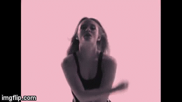
For our website we wanted the home page to contain an image of all three of us, this is because it is the first photo the user sees when they click our website. The image had to show clearly that we were a band, it also had to successfully put across our genre of music and style as a band. We decided to go with an image that was also used on our digipak this would mean that there was a connection through both products creating synergy and potentially making them both look more successful.
Female band such as little mix and M.O use images of themselves close together, this makes them appear as a typical pop girl band, this was something that we wanted to include on our website as we also fall under that category.
Above shows the image that we decided to use on our website, we used iconography through the use of light flares, these are also used on our digipak and music video. This is because our album is titled Light Me Up and as our first single we are going to release a music video from this also contains the same title, lights became an icon for our band. light flares are shown on every page of our website mainly in the back ground.
We made sure that this was consistent throughout all of our products, this would mean that the combination of all of these would be more effective.
Above shows an image that we used on our digipak, it is the same photograph that is used on our website. This allows a visual link to be created, between both products.
As we are a new band we needed to apply synergy and iconography to all of our media campaigns, this would initially help them to be noticed in the growing industry, by both their target market and others. Our target audience is aged between 11-13, they are interested in pop music, as they are quite youthful we would also expect interest in things like social networking to be evident. by researching and analyzing other similar artists digipaks and websites of the same genre we were able to come up with ideas that we could include. We knew that the Digipak needed to be colourful and lively to represent our music. we also knew that it had to contain synergy and a colour scheme. but it also had to match our other products like the website and music video. for it all to be effective they all had to work just as well separately as they do together. We decided colour would be the thing uniting our ancillary products together. Each member of the band has their own individual colour that was associated with them these colours are used so that the band members are able to become more recognisable in the public eyes, as they will hopefully see our marketing campaigns like our music video and associate the colours with the girls rather than just seeing them as another girl band, they will see them as one with an identity.
On both our digipak and website we used iconography this helped to create synergy through our products this was necessary because as a new band we need something to be associated with, we used pink lips on our website and digipak, we also had a lot of close ups of lips in our music video.
We also needed to make sure that there was a theme running throughout all of our products, they needed to be able to blend together and each part needed to be instantly recognisable with each other, because we have gone for a theme of lights this would be one factor, the other would be the colours. as there is a lot of uv lights in our music video this meant that a lot of the shots were a dark purple, we decided to go with this colour as the colour of our band, as it carries the connotations of royalty and power, and as we have a younger audience we wanted to take influence from bands like girls aloud and little mix who are all about the girl power. Using this colour would show that we aren't just a girly pop band but we are powerful as well, we wanted to be shown as powerful influential role models.
We have created a presentation going into more detail on how we made sure the combination of our main products and ancillary texts were effective.
We have created a range of feedback devices, these include things such as Surveys on surveymonkey and live screenings. These were completed and aimed the majority by our main target audience of 11-13 year olds, there was also a selection of people who were not our primary target audience. Receiving feedback from them as well was good because it meant that we were able to confirm the choices we had made, with the intentions of making it suitable for our target audience, and it allowed us to get a wider view on what the majority of people of different age brackets are into.
Here is a presentation that I made that shows a random selection of people from our target audience and secondary audience.
At the beginning of december once we had finished our music video first drafts, we showed them to our class and received feedback on our videos. As our video wasn't complete yet there was a lot more that we needed to improve on. A lot of the feedback was that it didn't really show who the artists were and you couldn't tell their personalities, as a result of this we then went out and filmed more scenes that expressed the bands personalities more, these were the scenes in front of the white background. we then showed it again once we had made these changes. People liked these scenes but weren't sure about the white background, they suggested changing it to our colours to show the bands identities more. This we included as we believed it would work better, the feedback as a result was a lot better.
To
To
Through our feedback we also found that people didn't agree that Taine (boy in first images) fit with our genre. However we needed this footage to complete the narrative so unfortunately we couldn't edit it out, if we were to film these scenes again we would consider using boys that fit with the genre more.
We created a survey that we sent out to people in the years 7-8 (aged 11-13) this was to see what the target audience thought about our music video, website and digipak and what they did and didn't like about it. My mum shared the link to our survey on her Facebook account, asking her friends to answer it, this meant that we could gain more of a variety of responses. The results we received as a result of this were good as it meant that we had a wider understanding and an audience with different interests and music tastes, answering the same questions to see what they thought.
I then put all of the results together in a presentation, this makes it easier to see what the results were that we received.
We also received feedback on our digipak, this was also from a wide range of people, these included our peers and a smaller selection of students all meeting the requirements of our target audience, here is some of the feedback we received from our first draft.
We knew this needed a lot of work before it would be ready. We still had one image to complete and a lot of text needed to be added. From the feedback we decided to tak out two of the sillouete images to enable clear picture of the band to created. This feedback was also what inspired us to do another photo shoot as the images we had were all very similar.
We also decided we needed to create synergy between this and the website so we included the band logo of the lips which appears on the website, used the same text and continued using the colour purple.
This was our final digipak:
You can see from these images that we made a lot of changes based rom our audience feedback, firstly we added a back panel containing the lyrics, secondly we changed the top right image to one more tile like. we also lightened the colours on the front page and changed the font so that it matched the website. The bottom left image we changed to one of us there was a similar version of this used on our website, this created synergy throughout our products. the image of the CD we changed although the feedback was positive we believed that it didn't suit our changed digipak and would look more professional like this, it also contained synergy with our website through the lips. the bottom left image we changed as one of the comments in the feedback was that there was too many silhouettes and as we already had the tile one, and it would be one too many.
We printed some of these out and handed them out to our target audience asking them for feedback on what they thought. here is some of the responses we received.
KEY:
1 - Top Left, 2 - Bottom Left, 3 - Top Right, 4 - Bottom Middle, 5 - Bottom Right, 6 - Top Middle.
1. 'its not very good, like the colours don't really work very well together with the background.'
1. 'I like the font at the top,but i think the bottom bit should have been the same.'
1. 'The two end photos are serious the middle one isn't'
2. 'I Like the photo its cute'
3. 'looks good'
3. 'The lips remind me of mean girls, and their book'
4. 'It looks really edited as you can see a white line around the people.'
4. 'I like the three monkey thing its cute and funny'
5. 'the songs sound fun and i like them but i dont get what one of them says (te amo) and it doesn't fit much.'
5. 'i like the photo goes well with the rest of it'
Not all of this feedback was positive but it was constructive criticism and it was all relevant, it showed what people really thought of our Digipak. These were all points that we could improve on if we were to do it again.
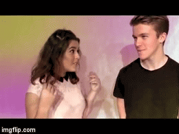
We asked a couple of year 9's (aged 13-14) to come and view our music video, give us feedback and then have a play about on our website. we recorded them whilst doing both of these.
The feedback we received here was overall very positive, and our target audience seemed to like both our music video and our website.
We also sent out paper surveys to tutors and asked them to be filled out after watching the music video, we understood that this would be a big thing to ask as you dont get much time in tutor and there are more important things to be completed. this was why we were really grateful with the large amount of results we received.
The image above shows one of the more positive feedback sheets that we received.
We then put all of the results together in a tally, the image bellow shows this. you can see that the majority of people rated our performance as 3-4. our costumes as 2-3-4. the locations as 3-4, convincingness as 3-4, along with weather or not it worked raiting on average between 3-4 giving it an over all rating of 4 mainly.
We then asked a group of year 9's the same thing and collected the results in a tally just like the one above.
For our media products; digipak, website, photo shoots and music video we used various bands and artists for inspiration. Whilst making these products we ensured we included as many of these inspirations as possible to make help our band follow the conventions of those similar. However we also wanted to be unique and create our own identity so we also tried to challenge these so we weren't like every other girl band out there that already has a name for themselves.
Our music video conforms to Andrew Goodwin's theory that the events and visuals in a video both amplify and illustrate the lyrics, we also used thought beat to match the beat of the song. It also supports some of Carol Vernallis's theory .
Below are our main inspirations:
Our Music Video:
Through research we found that conventions of the Pop genre include a band or solo performance, the member often dress of a similar or same style with slight changes to make them identifiable, so we decided to include these as some of the conventions of our music video.
We decided our theme would be lights as we found these were a convention of a lot of pop videos. With lights your get silhouettes, so we decided this would be something to make our video unique. We researched into some videos that including them and found one from Neon Jungle, who are a four-piece pop girl band.
We found some more unknown pop videos that included neon paint with UV lights which made them glow. We thought this would fit perfectly with our theme and would also add something special to our video.
One main convention of pop videos is colour. This is especially evident in girl band pop genre. They used bright, bold colours to create prevalence, making sure you were watching their video. However they often use splashes of these bright colours with darker backgrounds, or vice verse; having bright backgrounds and darker clothing. We decided to mainly use bright backgrounds with some splashes of colour in our clothing and make-up, but the main focus is on the background colours.
We watched the first videos released from all our inspirations, through this we found that in the openings they used different ways of revealing each member of the band. This enables the audience to see each member individually and see who makes up the band. We decided to use this within our video as it is to our first music video and our audience are unaware of who we are.
Also through watching many girl bands we found that most of the time if the song was upbeat, a dance routine would accompany the song somewhere in the video. It could be in the chorus of broken up and put it various places within the video and shot in various different places. We chose to use this convention and make it a distinctive feature of our video. We also thought our audience is of an age, that would enjoy learning and copying this danc We shot it in every location we filmed so we could see where looked best during editing, we decided the silhouettes looked best as you could really see the movements in front of the bright lights. I personally as a dancer choreographed the routine you can see in the video.
We watched one video by Zara Larsson called Lush Life. In this video she stood in front a white background whilst colours flashed behind her and her body was cloned to mimic her movements. We really like this idea so we decided to use the green screen and create something similar. We thought this would be a good place to continue expressing the colours that represent each member so during editing we made the clones these colours.
The most obvious convention of our music video is lights, strobe lighting, light walls and background lighting. The majority is bright lights to contrast the dark club and outdoor setting. We used as many different forms of lighting as we could think of. Through research we found that this was a feature some pop videos but not all, if the song had a more club feel then lighting was more likely. We felt 'Light Me Up' had this so we decided to include it. Lighting is often associated with dance music so with this as our main convention we are challenging the generic pop conventions. 1) The Light Wall
We shot the bulk of our music video in Miya nightclub which had a six piece light wall. We could control the colours, speed and amount of lights on show at one time. We used this for dance scenes as it allowed the audience the really see the movement. At points where just one person was shown in front of the light wall we changed the colour to match the band members colour. We found this was another convention of girl-bands, for each member to have a colour.
2) Coloured Background
Originally this was a white background
however through feedback we decided this was the weakest point in our video. So we continued the theme previously used and added the colours of each member onto the background whenever they were in front of it. We also used prevelance here as nothing else is going on in within the screen so the audience can only look at the person/ people within the screen.
3) Outdoor Lighting
Taking inspiration from a Selena Gomez, pop video, we shot some scenes outside with people
in the background shining various torches and glow sticks around. The lights were all shining on the member or members of the band so that the audience again had to look at them and not what was happening in the background
4) Spot Light
We used the spotlight in two different ways. At first we made the room completely dark and then turned on one single spotlight behind us. This made all the focus on us and when we moved around create bright bursts of light. The second time we again made the room pitched black and then placed a spotlight behind a white sheet and stood in front of it. This time it created silhouettes, which we had previously seen in a lot of pop and dance videos.
Music Video Conventions:
Andrew Goodwin
Goodwin suggested that there needs to be a relationship between the lyrics and the visuals, our relationship illustrates and amplify's both the lyrics and the title 'Light me up'. As our main convention is lights, we are are illustrating the lyrics. We also want these light to become our iconography, which is a certain trend or trademark a particular band or artist has to make them identifiable. Using these in all our ancillary product also helped this.
Our front cover of the digipak has glimmers of light in the background, again continuing the light theme.
The background of the website looks like blurred lights,creating synergy by continuing the light theme.
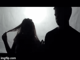
We also illustrate the lyrics through the little narrative we have between the boy and girl.
Here we show the boy chasing the girl, but she isn't interested so she pushes him away.
We also amplify the main lyric in the song 'Light Me Up' through our dance moves
All of our cuts and transitions are to the beat of the song, supporting Andrew Goodwins theory of thought beats, which enable us the see the sounds.
Carol Vernallis:
Vernallis said that there does not necessarily need to be an equal balance between narrative and performance and the narrative is not always completed, it may be disjointed or fragmented. This is the case in our video. We don't have a narrative running the whole way through however they are moments with both a boy and a girl which suggest a romantic narrative.
Vernallis also stated that mid shots and regular close-ups are common to enable the audience to familiarise themselves with the face and look of the artists.
We used these for the majority of our shots as it is our first video we want our audience to be able to recognise our faces and be familiar with them for future reference.
Website:
Using the same conventions and taking inspiration from other artists we created our ancillary products, in these products we tried to create synergy through the use of colour, images, text and more. Below I explain the conventions of our website and why we used them:
Digipak:
As our website was created before our digipak we used the conventions from our website within our digipak. We looked at various digipaks from both solo artists and girl bands for conventions and inspiration. Below is our final digipak:
From this you can see the that the colour purple was our main theme, the same as in our website. We used purple as it is a stereotypical girl's colour, who are our primary audience, however it could also appeal to boys. We didn't want to limit the appeal of our image to just one audience. It is also a bright, bold stand out colour that people will be able to easily recognise and associate with our band.
For the front cover of our digipak we took inspiration from Neon Jungle's first album cover:
We thought having three separate images showed that we weren't just a band, but we have individual identity's. We continued our convention of our colours and had our individual colours as the background.
We wanted to continue to theme of lights throughout all our ancillary products, so our digipak have to have glimmers of lights. We also took some screenshots from our video to create synergy between the products. For our back cover we looked at The Saturdays album, at first I tried editing the text exactly they have it; with a black background and a rainbow effect on the text. However after comparing it with the other images we have already on the digipak, we decided as a group that it didn't fit with the conventions we currently had.However we liked the text we had used but we felt it still needed colour so I played around with some different ways to inject colour. After watching the video I saw a shot of a purple light all and thought it would fit perfectly with the rest of the digipak, so I screenshot the image and placed it in the background.
The image below is the CD within our digipak, the l ips that appear on the CD also appear on nearly every page of our website. We are using Andrew Goodwins theory of iconography, which is something that is recurring with that particular artist, their audience expect to see it in their products and it helps them be identifiable.
We decided to name the album Light Me Up after lots of research into Girl-bands first albums. I found that most of them were named after their first or second single release. It helps our audience remember us and easily identify our album to our single. It also created synergy as the lights on the digipak now have a meaning behind them.


 To
To 
 To
To 


 One main convention of pop videos is colour. This is especially evident in girl band pop genre. They used bright, bold colours to create prevalence, making sure you were watching their video. However they often use splashes of these bright colours with darker backgrounds, or vice verse; having bright backgrounds and darker clothing. We decided to mainly use bright backgrounds with some splashes of colour in our clothing and make-up, but the main focus is on the background colours.