Saturday, 17 October 2015

Website research

Over the weekend I have been looking at similar artists and their websites to gain influence for ours.
little mix are a very similar band to ours as they are both pop and a girl band.
I like their website becauses the main focus is of them as a band, the background is images of them that change when you hover over them. another thing i really like about their website is that the have a 'The Girls' section allowing the audience to get up close and personal with each of the members. This would be great for us as we all have our own personalities and we are a new band.

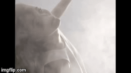
The colours of this website home page are subtle and cool. It contains their logo at the bottom center and the links to other pages on their website. when scrolling over the videos link the page changed to this layout...
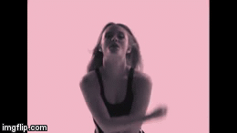
This is more vibrant and colourful, and goes with our band a lot more. they are also all wearing colour co-ordinated outfits like we do. 
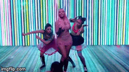
when clicking on the The Girls page you are taken to a page split in to four sections for each member, they look serious and it is in black and white making them look sophisticated. 
when scrolling over each picture it changes revealing the girls name and a more humorous childish photo breaking the the intense feel and showing that they are a fun band, i like this idea and design a lot and think we should do something similar on our website.
         
Another similar band are  they are also a pop girl band. Here is there website. 
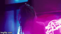
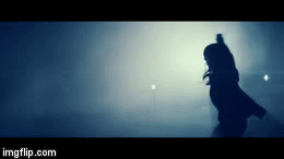
This website focuses mainly on the music of the band, after they recently lost one of there members to suicide they made a song in her memory called light house, the music video for this song is hugely influences by the use of lights, this is reflected in the layout and design of the website. i like the way their latest music/videos influence the layout of the website.

Another band similar to ours is the saturdays, I am not really drawn to this website as to me it seems really cluttered and too overpowering it is also hard to navigate. 
The last website i looked at was for the band M.O their website was all on one page and the links just took you to a section further down saving you scrolling, i like this as it is easy to navigate but it feels to much like a blog.

here is a quick mock up design that i created for our website with huge influence from all of the mentioned websites, it contains a large image of us with a white border with our band name a button to our music and links to our social networking.

Friday, 16 October 2015

Make up

Today In class we printed of some templates to mess around with the make up that we are going to use in the club scenes, we decided on our colourschemes a few lessons back but today after getting feedback we decided that they weren't right and changed them, Frankie is going to have orange green and white, Olivia blue purple and white, and I am going to have pink yellow and white. 
Here are the print outs with the lip colours we are going to use on them...
Here we experimented with what glitter would look like but we decided that it will look like too much so we are going to save the glitter for the garden scenes. 
We each then went of and designed a different pattern for our individual styles and faces. Here is mine...
I decided to go with more of a floral influenced pattern, I used the pink as the main base colour as it is the most girly and yellow as the highlight. I used a lot of dots as they are cute and the patten increases the girly ness of the design. Over all I am pleased with the outcome and hope that the designs look as good when we try them out on Tuesday.
Frankies design:
Olivia's design:

Thursday, 15 October 2015

Filming/dance rehearsals

For one of our locations we are going to film in our schools drama studio, for this we had to get permission, Frankie emailed one of the drama teachers and asked if we could use it, 
This was all sorted and confirmed but a problem occurred when we got there on the Tuesday evening and she had forgotten and started to set up a club with her year ten students. But after asking nicely she decided to move to another room so that we could film. 

Monday, 12 October 2015

Choreography

In are group we are extremely lucky to have frankie, she has a dance background and has been able to choreograph a dance to the section of the chorus of our song, we are going to perform this in the drama studio with lights facing the camera and in dark clothing. we may also shoot this in the club on the dance floor. and in the garden scene possibly getting everyone to dance it too creating a new dance craze.
below is the video of the dance frankie choreographed.

Video insperation

whilst creating our steal o matic i discovered this music video, it is for a song called Lush Life by Zara Larsson, i showed it to my group who all fell in love with the idea. the video uses after affects to add colour and other affects to the video, without these the video would be very boring as it is all in one location and there is not much going on. we took this as inspiration for our firsts filming, we shot each of us individually singing the whole song, this way we can crop any part of the song and use it if we need extra shots. we will then edit this with similar effects as the video using the following...
Cloning
Colour
Slow motion
(onion) Layering

social networking

We have created accounts on three of the most popular social networking sites, this is so that we can help publicise our band and keep our 'fans' involved.
here is a screenshot of our twitter from an i-phone...
our instagram...
And our facebook...
we all have access to these accounts and will regularly post on them signing them off with a initial and an 'x' this is to keep our band image and allow the audience to connect with each member of the band. All of these now have been updated since these images, this was because as we continued with the project we were able to develop more of a brand image.

Saturday, 10 October 2015

Possible album cover

Here is a rough drafted idea of an album cover I created using an app on my iPhone. I took influence from a photo collage that little mix had for a magazine where they were all styled in a 60s fashion, this photo was in black and white but I chose not to do this as I feel like the photos look better when they are not on black and white. 

Here is one with our possible logo in the corner

Below is what it would look like in black and white, it is more subtle and classy but less pop.

Friday, 9 October 2015

Logo ideas

feedback
Max: feels like the bottom one isn't enough.
Scott: bottom to plain top too much, like the crisp outline, looks casual and professional.
Bessie: top stands out more glow draws attention to it.
Jess: i like the pop of colour in the top two but i prefer the top.


videos that influence us lights and colour wise.

                                                          
Nicki Minaj's music video for her single 'the night is still young' used a lot of neon pinks blues and yellows these are all colours similar to those we wanted to include in our video. we have thoroughly looked through the video to see if there was anything that we could possibly use anything similar to her.

Wednesday, 7 October 2015

Photoshoot (the outcome)

Our photoshoot went really well we took over 700 photos which seems like a lot but when we looked over them we realised that only around 15 were usable mainly because one person was either blinking or out of focus. 
We now know that next time we attempt something like this to make sure that everyone is ready, to maybe get someone else to take the photos so that we are all in focus and to look at each one after we take it to see what we need to change. 
Here are a few of the photos that we took, they have been edited by me to give them a more realistic feel and make them apear less in your face and bright with the green screen background, we are going to edit them further removing the green screen and replacing it with something more apropriate. 
In this photo we decided to go for the 'mainstream commonly used by teenage girls' pose the pout. This is so that we can show our audience that we are just 'one of the girls'. It makes us look youthful and fun and suits our audience as well as our genre.
This one we decided that we were going to try and show the audience our characters through the image, this was done by the way we posed, for example Olivia (right) is the 'diva' she is shown more frontal than the others to show a more dominant powerful role her expression is straight making her look more grown up and sofisticated, the way she has positioned her body with the touching of the hair shows that she is one who cares for looks just like many well known divas in the Pop industry (BeyoncĂ©) it also shows her in quite a sassy way which is what she was going for. 
Frankie (left) in this photograph is shown facing a different direction to everyone else, this makes her feel more individual and edgy. The way she is facing the audience makes the photo more personal and allows the audience to feel like she is looking at them creating a connection between her and the audience. The way that one hand is leaning on the wall shows that Frankie has a relaxed 'cool girl' attitude which is exactly what we wanted the audience to think. 
In the centre of this image is me, I am going for the more 'pop princess' look my role as one of our teachers said is to 'attract the younger audiences and make them want to be me'. By bending my knees and leaning my arms backwards it presented me in a more innocent way, alowing the younger audience to feel more of a connection. I am shown almost smiling this makes me apear more freindly and fun things often referred to when talking about someone 'Pop princess' like. I am holding out my skirt, this almost shows me to be going something much like a curtsy, something often assosiated with women making me seem more femanine and girly.
Here we are all doing the same hand on hip pose. This shows that we are a unity and a band, we belong as one. Although we are all stood the same there are slight differences that make us all stand out individually. 
Olivia is shown at the front this draws a lot of attention to her and she looks like the leader. Her head is slightly raised making her seem powerful. Her hair is flicked over dramatically to one side making her feel more dramatic giving of the impression that she is a diva. 
Frankie has a more 'Victoria beckham' expression making her seem sassy and edgy, she is in the middle which draws a lot of attention towards her which is good because she is meant to be the 'different' one so we wanted her to stand out, this also worked because she was taller. 
I was positioned at the back this was because it meant that little attention was drawn to be making me apear smaller and cuter, Frankies arm is sheltering most of my body making it look like she is protecting me giving of the sense that I am the baby (spice) of the group. 
In this image we decided to go for a less serious pose, we wanted to make sure that we didn't look serious and sassy all the time, that we looked fun and happy. We did this by all smiling, bending our bodies and making gestures with out hands. Although we did this we were still able to show our personalities through this, which was our main objective as we are a new band so we really want the audience to connect with us. 
In the photo you can see me sitting down on a stall in the centre of the image, this positioning makes myself appear smaller I am also slightly further back that the other girls emphasising this. Smallness is often assosiated with being cute, cute was what we wanted to portray so I believe we succeeded with this positioning. 
Olivia is making the peace sign with both of her hands, this symbol relates to the 60's when it was used to represent peace and free love, this when assosiated with this shows her to be powerful, it shows that she represents equality and enforses pease making her seem like a more dominant figure, her hair is pushed to one side making her look sassy.  
Frankie is shown here laughing this makes her look fun and makes the audience want to know her. The way she is leaning forward invites the audience into the image making it apear welcoming. 
Olivia's hands in this photo are positioned on her chest pointing inwards drawing attention towards her, this presents her as the diva of the group.  The slight smile on her face shows that she has sass as it is more of a cheeky smirk. 
Frankie is framing her face with her hands this draws the attention to it, this is good on a bands first photoshoot as it means that the audience is forced to look at her face, the more that they look at it the more they will recognise it and assosiated her with our band and our music. She is the only one shown not looking at the camera making her look more induvidual. 
In this photo I am shown playing with my  hair this is often shown as quite a girly thing to do, it is seen in films like clueless buy the 'fashionista girly main character' in this photo I am also positioned to appear smaller than the others to apear 'cute'.

Typical Audiences

In class today we were shown three different artists and bands and we then had to describe who we believed their audiences would typically be like and to describe things about them such as their clothing and other intrests
The Arctic Monkeys:
I believed their typical target audience would be mature teens and young adults probably ranging from the ages of 16-25, based on their indie rock style of music their most popular audience would be male and into style trends such as the more grungy look, also including Mod and other more vintage looks, dressing in darker scruffy clothing carrying a cool calm relaxed 'doesnt give a sh** attitude'.
One Direction:
They have the target audience that is much younger, possibly even the complete opposite, based on their cute friendly boy next door look causing all the 14 year old girls to swoon over their charm. Their audience would most likely be young girls aged around 10+/- (although most people do seem to have a guilty liking to at least one of their songs) this is because they are a more mainstream band meaning their music gets played a lot more on things such as the radio and music stations.

Top Tips

On Friday the 2nd of October 2015 Pete Fraser and Jake Wynne visited our school and gave a talk on tip and experiences in the music video industry. I found this very useful as Pete went into detail about what we needed blog wise to get a good grade, he spoke about all the things we should do in preparation for final draft and afterwards. Jake also gave us feedback on our initial ideas.
Pete Fraser's tips included:
Plan for everything
- Storyboard (even if you shoot extra scenes after)
- Plan who, what, where, when and how (make sure that everyone is organised and has everything you need)
- Aim to shoot early so that you can always shoot more and its not up against the deadline.
- Make sure that everyone has rehearsed everything (performers and crew)
Know your equipment
- Do test shots so that you can test the effects that you are going to use
- Check any quirks of the camera
- Make sure that you have a tripod and a shoe
- Make sure that you will have enough memory if not bring back up cards
- Experiment with editing before you do your final
- Make sure that you have an audible source of the song so that not only the performer can hear it but the camera as well.
The shoot
- Shoot the performance at least ten times with different set-ups
- Make sure that you have plenty of cutaways
- Experiment with extra angles and light changes
- Dont forget: lots of close ups!
- Enthuse your performers - they must give it plenty!
- Shoot more than you think you will need.
The edit
- Sync up the performance first
- Get the whole picture rather than tiny detail
- Cut cut and cut again
- Aim for a dramatic piece of work
- Do any effects work last
- Upload a rough cut to your blog and get feedback
The blog
- Evidence of whole journey
- Research, planning, construction of all 3 products
- Evaluation
- Finished products
Good house keeping
- Tidy desktop
- Storage of footage
- Labeling files
- Tidy blog
Evidence
- Real music videos
- Real music videos (of your genre)
- Any visuals that have influenced you (films, TV, adverts, music videos, photos)
- Steal o matic
- Costume photos, location photos, test shots.
- Real album covers
- Real band websites
- Early exercises designing album covers
- Changes to your design-screengrabs
- Show how it is a 'package'
- Student music videos, digipacks and websites with comments
- Jake's videos and tips from today
- Photos and clips from today
- Storyboard and animatic of your video plan.
- Feedback from your peers
- Rough cuts of your video
- Screengrabs of your edit in progress
- 'Behind the scenes'
- Regular commentary on what you are doing
When to do digipack 
- In parallel, NOT at the end!
- Taking photos for later use
- Having lots of extra ideas
- Can do more than one design within the group

Jakes tips:
- Emphasising the 'performance bed' which means you have a layer of a few performances of the band/artist singing the whole song so that you can then add all the other stuff on top but at least you're covered and get an idea of the whole structure.
- The website where you can make music videos for peoplehttp://www.radarmusicvideos.com/home/about-us
- Dynamism and not giving away all your tricks early on, build slowly and make everyone want to watch more.

Tuesday, 6 October 2015

Style

Frankie researched similar artists and their styles, she then looked at each example and picked out all of the similarities showing what we need to include when thinking about our outfits.
Frankie is going for a more edgy look like shown above.
I am going for a sweet girly look
and Olivia is going to be the diva of the group.

Monday, 5 October 2015

Goodness gracious

Goodness Gracious by Ellie Goulding is a video very similar to the ours this is because of the use of UV and bright neon colours. The song itself is quite pop like ours.
there are a lot of shots that we liked in this music video along with the general style of the video.

Sunday, 4 October 2015

Videos we took influence from..

Here are some snapshots of videos that we found interesting and took influence from. Wether it be the shot angles the mise en scene or the whole thing in general we noted them down and took screenshots.

All Time Low - Kids In The Dark
We liked these and thought that we cold do something similar as 'in between' shots to 'break up' the video, these would be of other people in the club they would not be of the artist but different varieties of people looking happy and cheerful.